Poster · 2014–2019
Judo Regionalliga Posters
2014–2019
My local judo club hosted a judo day of competition for 4 years. The recurring use of the color blue is connected to the judo club’s logo.
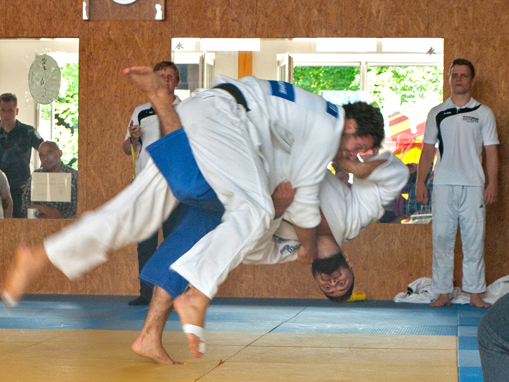
POSTER · 2019
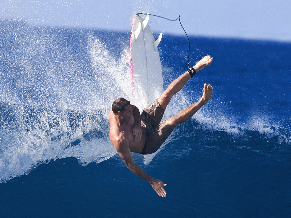
Have you ever been kicked off from a surfboard by a big wave? Once a wave hits you unprepared, you won’t find a way to get out of the disaster. A experience the judo opponent in the photograph must have shared in the given situation.


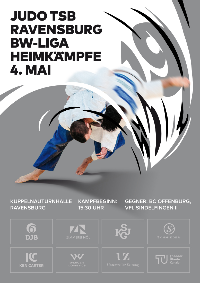
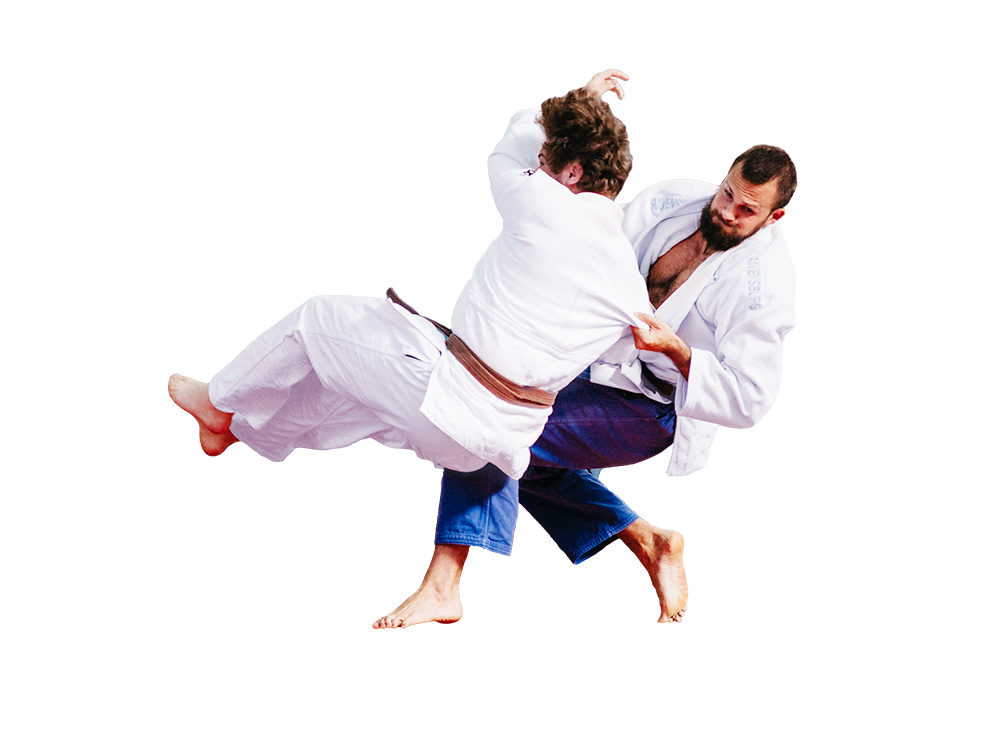
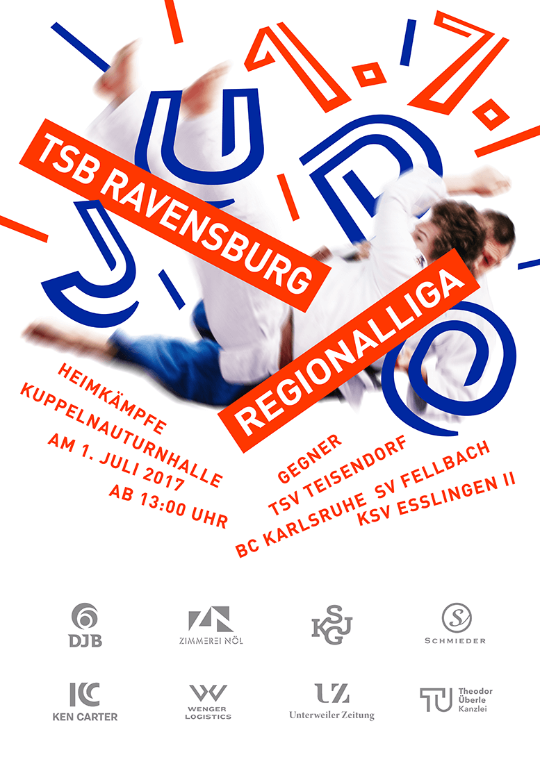
POSTER · 2017
By removing the background of the judo scene and adding white space underneath the judokas, the picture became much more exciting. The text of the poster is following the falling movement to exaggerate the effect of a tremendous impact.
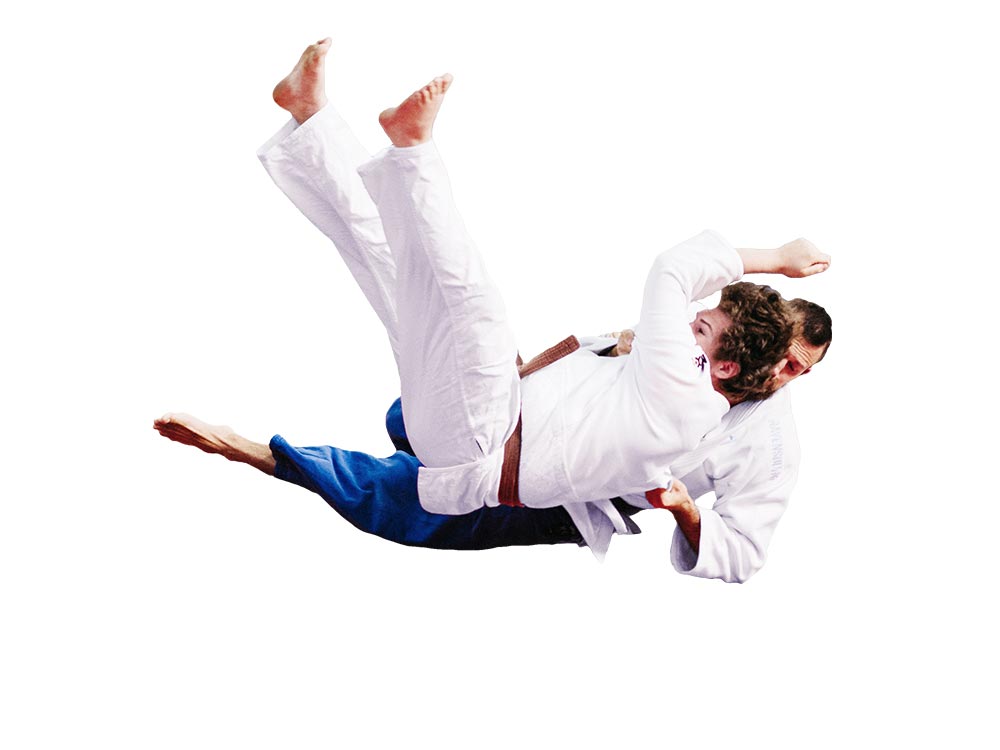
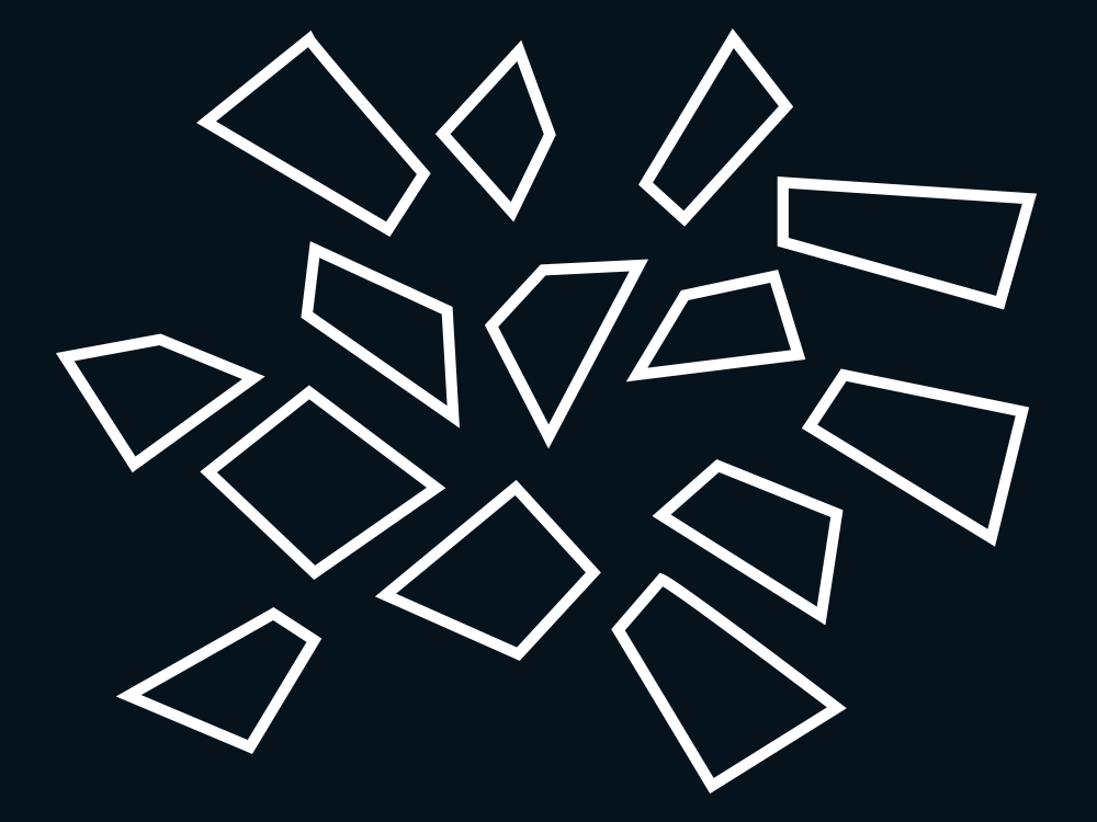
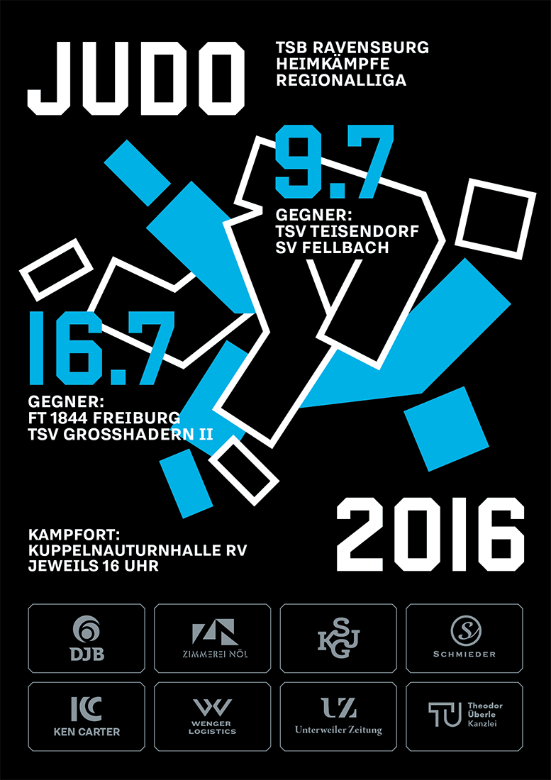
POSTER · 2016
I did Judo myself in my childhood, and as I was browsing through some pictures, I got reminded of the pain when your opponent throws you on your back. That thought inspired me to think of a way to visually translate that painful “shattering”-experience to the Judo poster.
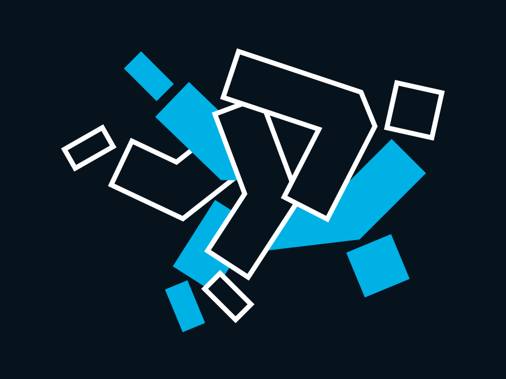
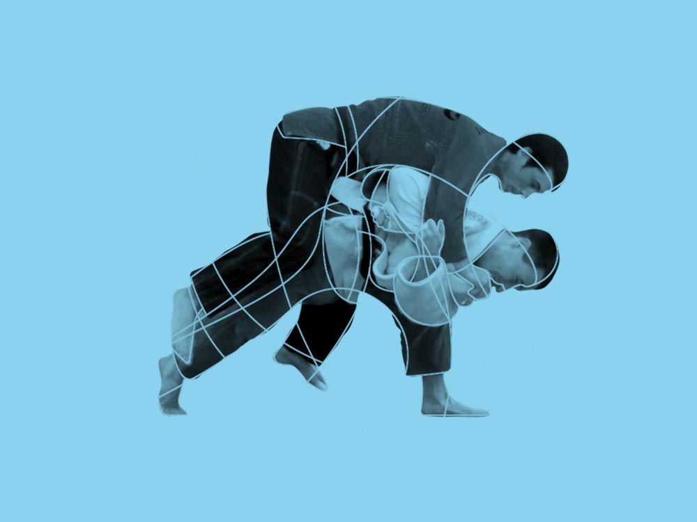
POSTER · 2015
Judo is a very complex and dynamic martial art connecting balance, strength, technique and flexibility. I tried to visualise these attributes for my illustration to advertise for the upcoming days of competition.


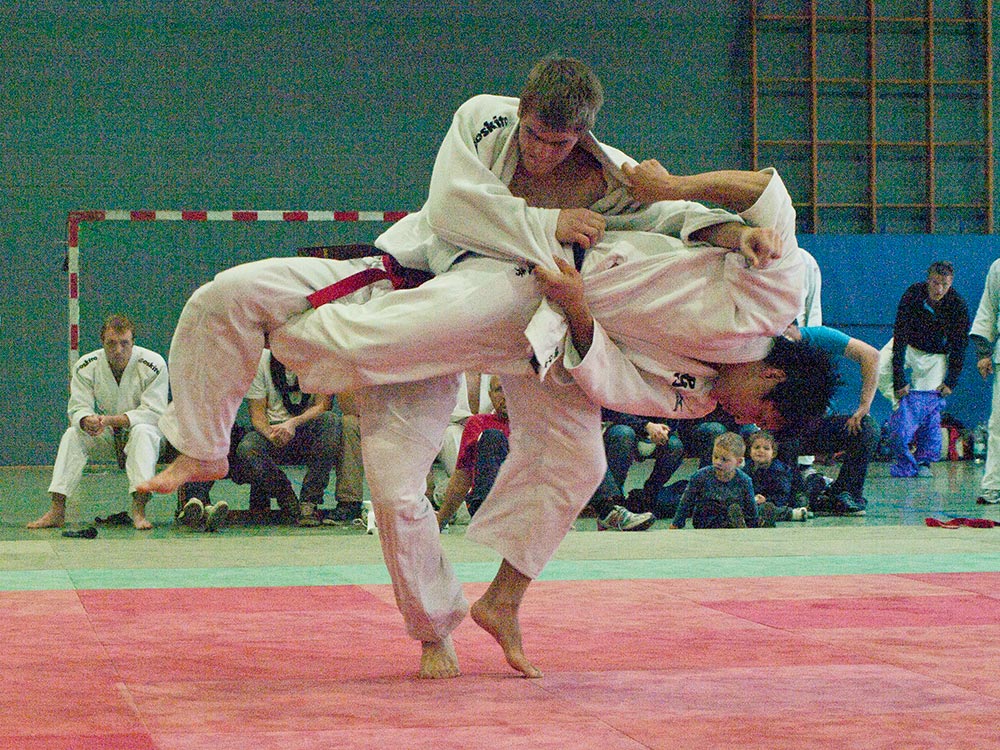
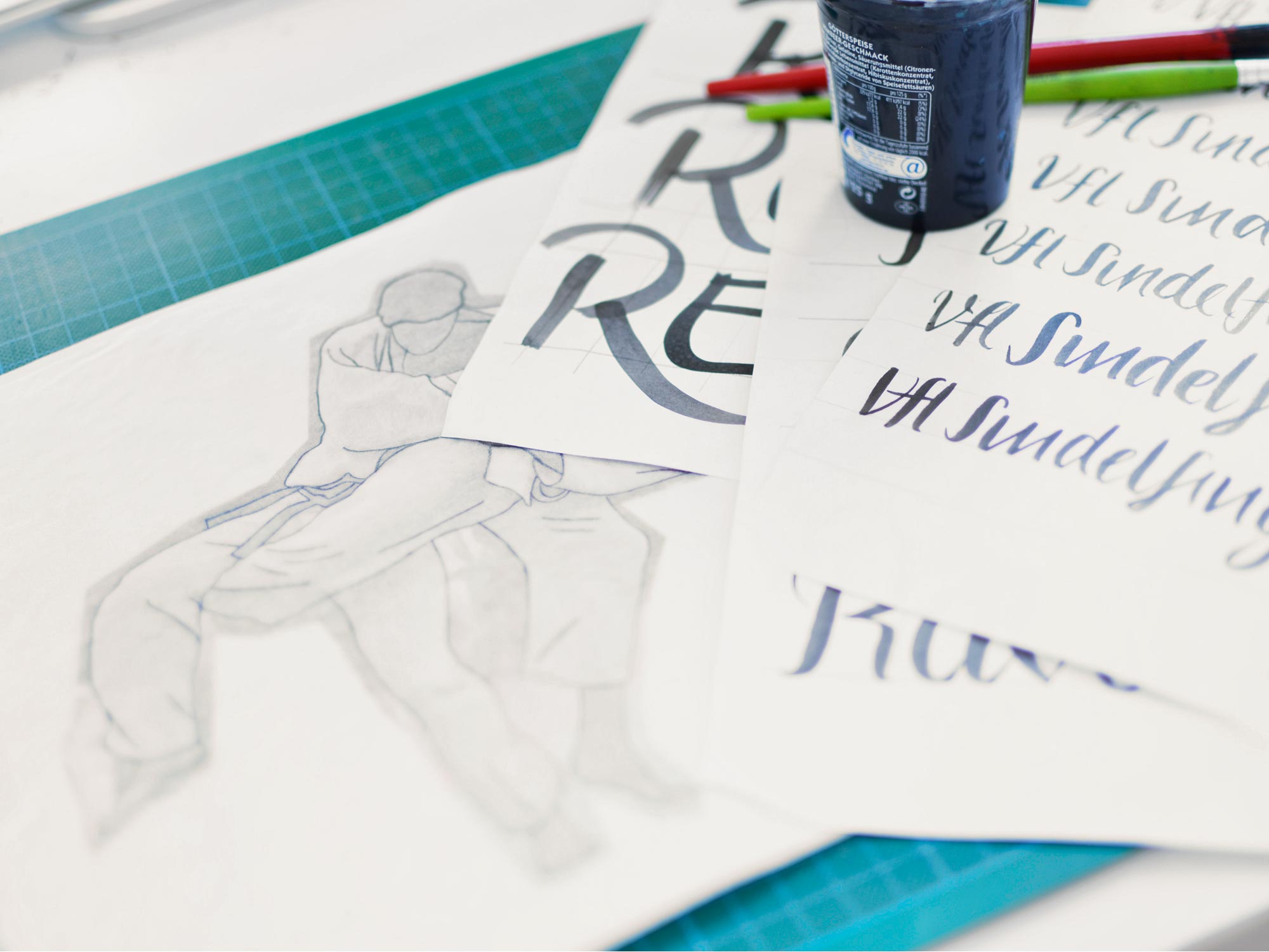
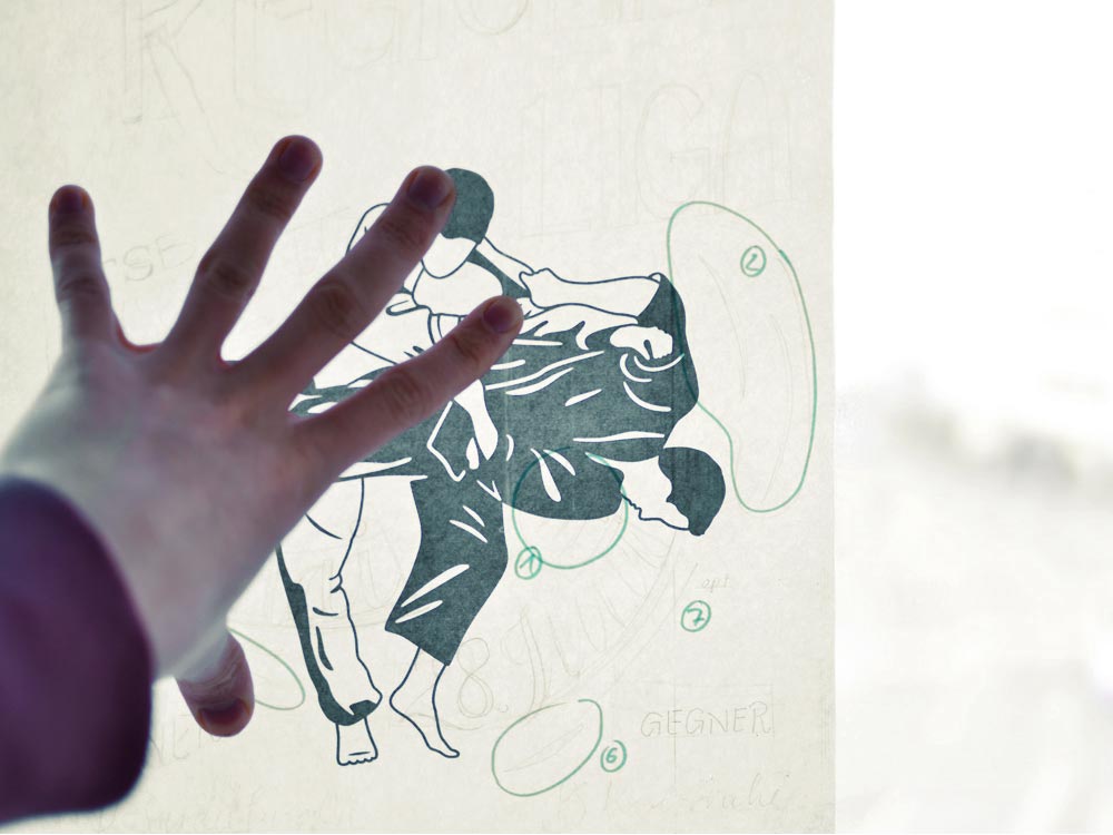
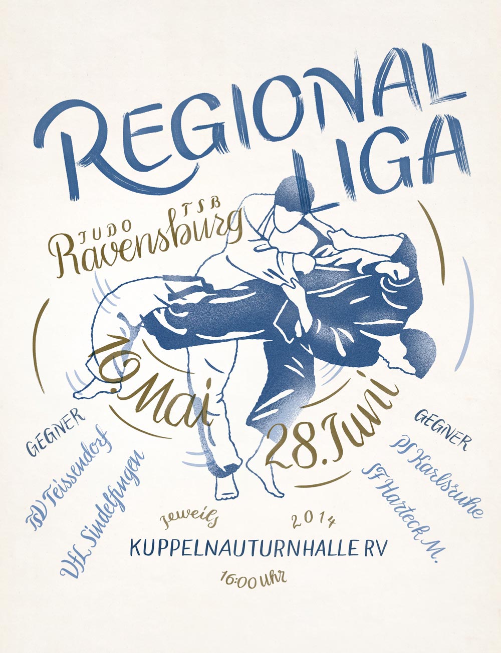
POSTER · 2014
This amateur snapshot was just perfect for a poster. Unfortunately, this picture lacked in quality. For this reason, I made an illustration out of it and used my interest in lettering to advertise for this event.